
During our engagement as a Fractional CMO, we provided a rebrand for FX Lighting, an industrial LED lighting company formerly named Fintronx LED. This company’s products were patented and had many attractive features that addressed all types of use cases. However, the commercial lightbulb market is highly saturated, with a complex sales infrastructure that often includes sales agents and other third-party partnerships. We set out to take them from blending in with the crowd to standing apart, both visually and in customer experience across the buyer journey.


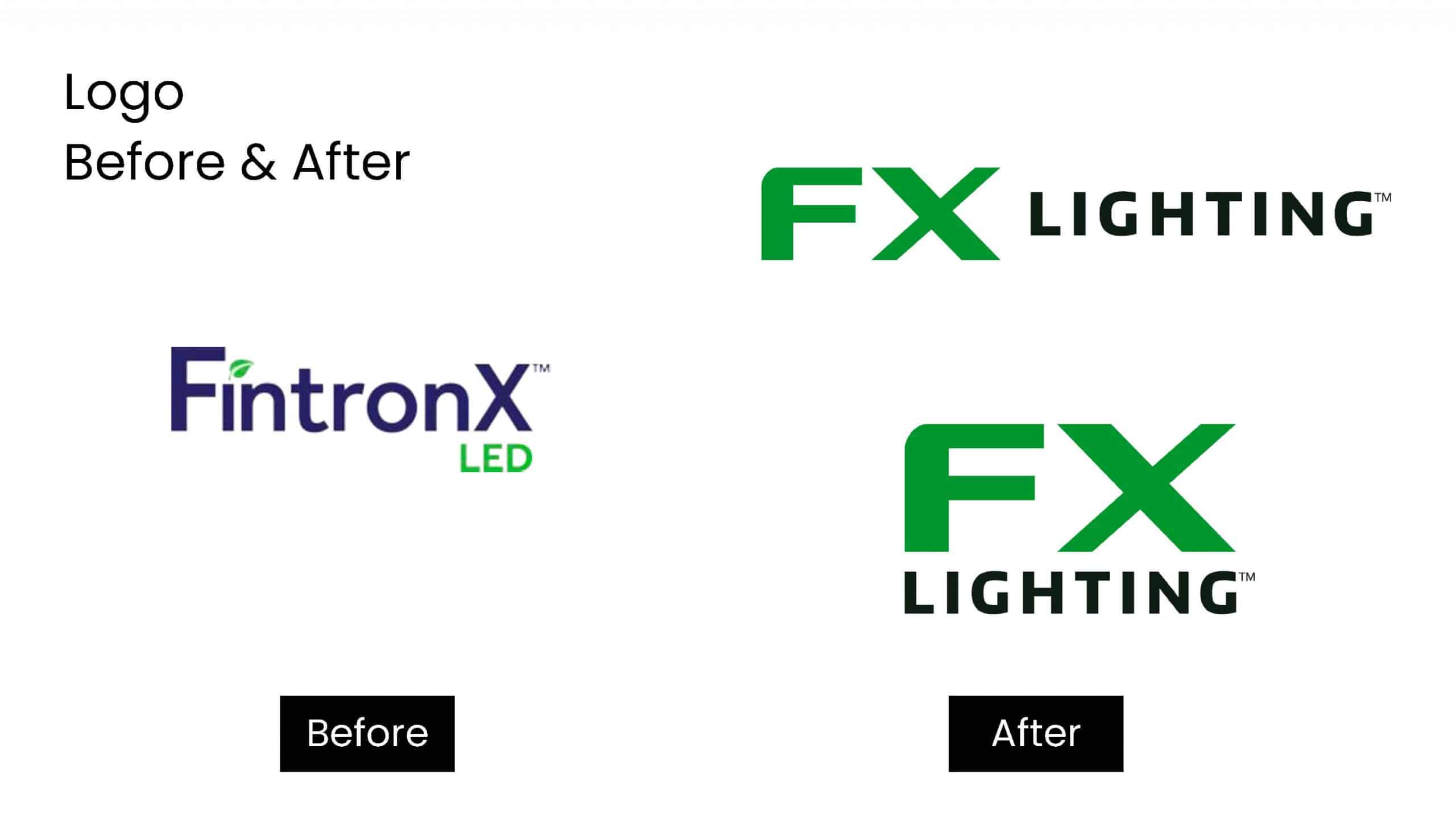


At the start of this project, Fintronx’s logo looked like a pharmaceutical brand. All of the collateral, including the website, was riddled with blue and green color blocks and inconsistent photo treatments, making everything visually heavy and challenging to look at. Lightbulbs, even LED ones, are commoditized, so standing out is crucial. Most competitors in this space choose black or dark blue as the foundation of their brand because it is easier to show light in the presence of darkness.
The Fintronx team gave us some brand adjectives to work into our design strategy: Rugged, Strong, Durable, Manly, Quality. Our main objectives were to “lighten things up” by creating a clean yet engaging aesthetic for presenting standard product information for commodity products, build a flexible visual system by specifying elements (textures, icons, and photo treatments), and ensure that all content was concise and easily shoppable in a complex sales process.
The audience was commercial facilities managers for industrial warehouses, factories, and other manufacturing facilities that could benefit from energy savings associated with LED lighting, waterproof lighting for washdown areas, and the overall safety benefits of improved visibility. This audience consists mostly of men who work in heavy-duty environments and are dedicated to keeping their facilities in top operating condition while also providing a safe environment for employees. We chose to take the bright, white, “be light” approach with a hint of safety warning yellow. We specifically worked to avoid color blocking and focused on straightforward presentation with minimal added color that brings sophistication to a rugged conversation. A major part of this visual execution was contextualizing the products by using images that represented their use cases.


The company’s new brand was so creative and conspicuous that it caught the attention of many long-standing industry institutions, inciting a race for acquisition. After several attractive offers, some of which specifically cited the brand as a significant factor, a 35-year-old player in the industry acquired FX Lighting; we were then tasked with lightening up other portfolio products by applying the clean yet innovative FX Lighting look and feel. This work is ongoing. Expanding a brand that was originally developed for four to five products to accommodate hundreds of products is not a small task. The Hazardous Environment Brochure was our first attempt at applying the brand to the new selection. After lots of refining, we now have a formula to tackle the massive new catalog.

To provide the best experiences, we use technologies like cookies to store and/or access device information. Consenting to these technologies will allow us to process data such as browsing behavior or unique IDs on this site. We do not sell or share your personal information. Not consenting or withdrawing consent, may adversely affect certain features and functions.